 Carrier Crow
On this page
How does the email template editor work?
The Settings Panel is divided into 2 parts: Appearance and Content.
Appearance
In the Appearance menu, you can get access to the following settings
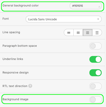
General Settings
In General Settings, you can set up a Message width, which is 600px by default. You can set any size between 320 and 900px.
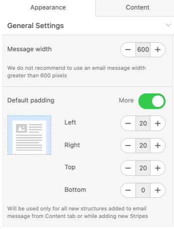
Set up Default padding, which will be used by default for all new structures added to email from the Content tab or while adding new Stripes (rows).
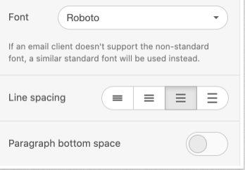
Below, can pick the basic Font for the whole message, enable the Underline links control, set the default Line spacing for all text elements of the email.
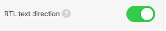
Also you can enable the **RTL text direction **option. If this control is activated then text direction will automatically go from right-to-left.
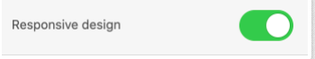
Responsive design option, enabling this option may help to improve mobile displaying. However, notice that results may vary on different devices. If this control is disabled then mobile version of your email message will look like the desktop one.
Here, you can set up Background color or Background image for a whole email.
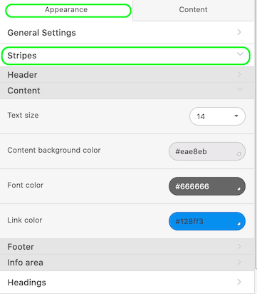
Stripes
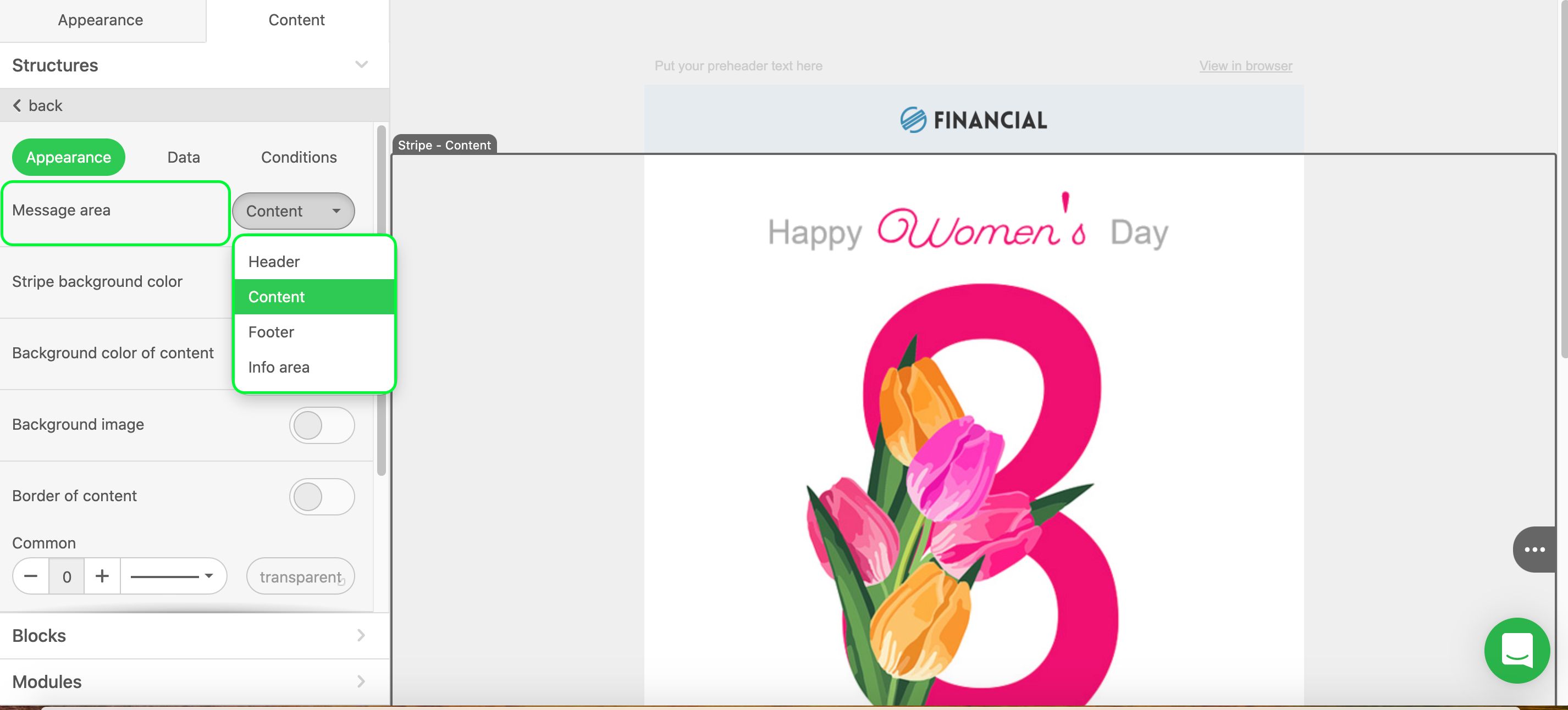
To define Stripe (row) as a Header, Content, Footer, or Info Stripe you should click on it and set its value in the Settings Panel.
In these menu tabs, you can set up any setting that will be applied to each Stripe (row) respectively.
Here you can set Text size, Content background color, Font color and Link color.
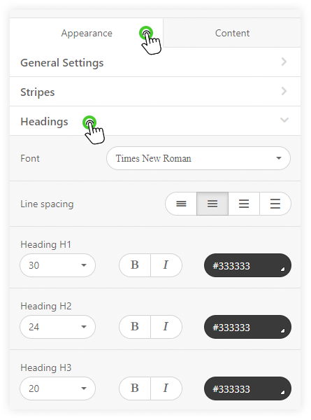
Headings
Here you can set default font style, size, color, bold and italics fonts for H1, H2, H3 headings.
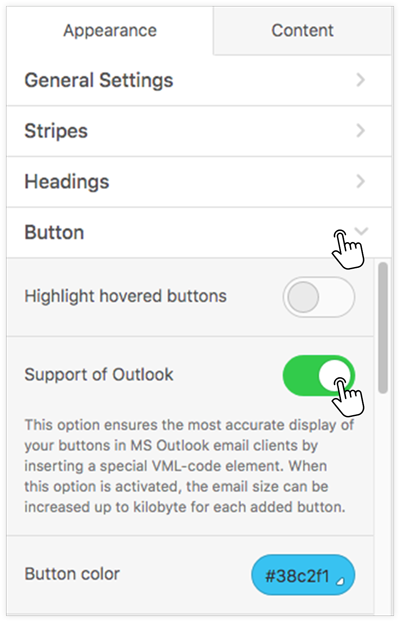
Buttons
The Button menu allows you to set some parameters that will be used for all buttons in the email by default.
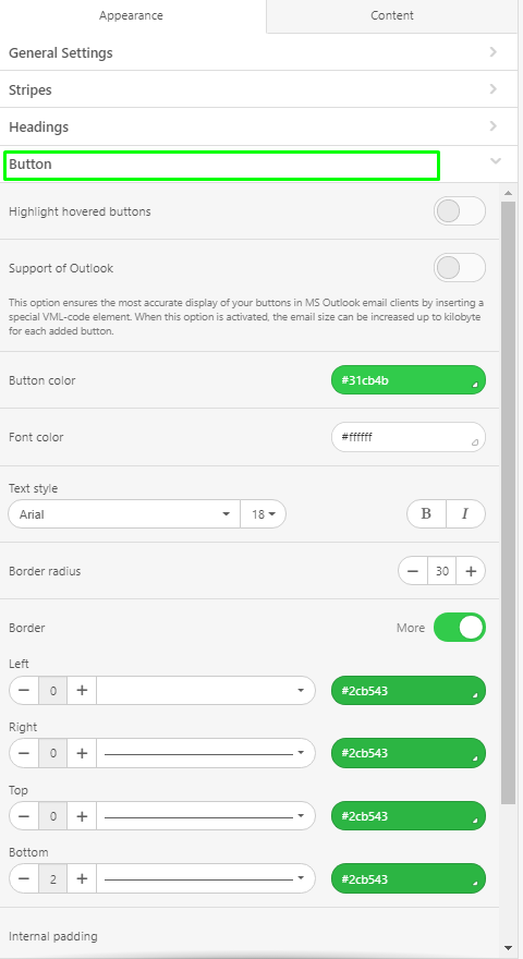
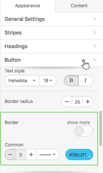
Here you can set Button color, Highlighted button color, Font color, Text style and size, the thickness and italics parameters, and also set Border radius (the default setting is 30px).
Support of Outlook button allows to improve buttons displaying in Outlook, by inserting a special VML-code element.
Moreover, in this section of the menu, you can set Borders and their colors. You can set them individually for each side...
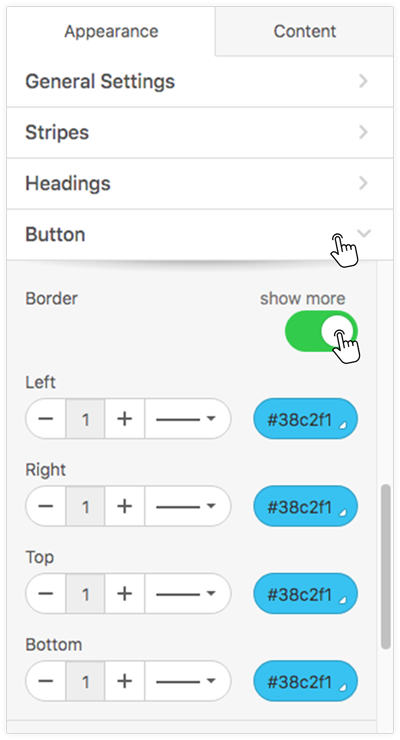
...or all sides at once.
You also have the ability to change the color of the button’s Border and turn on Highlighted border color.
In addition, in this menu, you can set the Internal padding for buttons, independently for each side.
Mobile Formatting
Here you can control how your email will look like on mobile devices.
You can set Size of Header text, Size of the Content text, Size of Footer text, Size of Info area text, the Text size of the items for the «Menu» block, Text size for headers H1, H2, H3, set Horizontal alignment and Email Content Margin for them.
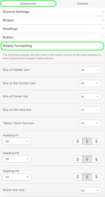
You can also set the text size for the buttons to be the full width of the mobile device.
Besides, you can adjust the padding for any block/container/structure for mobile displaying, for that you need to click on the mobile icon and set the padding
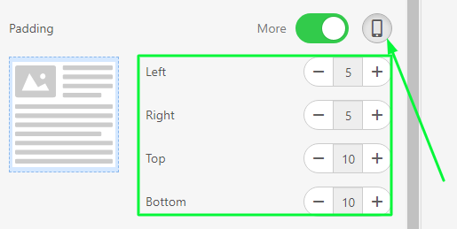
Please be advised, the default values for the desktop version of emails/templates are used for mobile view. So if you are not going to use the same padding or text/image/button alignment, click on the "Mobile" icon and set padding/alignment which you like.
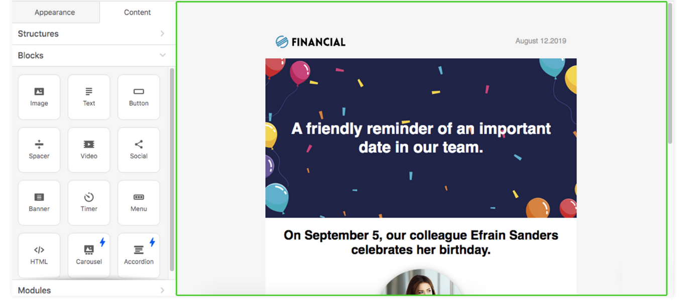
Content Menu
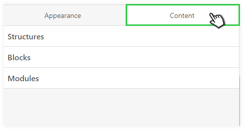
In the Content menu, you can get add into your email Structures, Blocks and Modules - the main elements of the email message or template.
To create such a "skeleton" of the template, you need to drag a Structure which needed numbers of Containers and then just fill them with content Blocks or Modules.
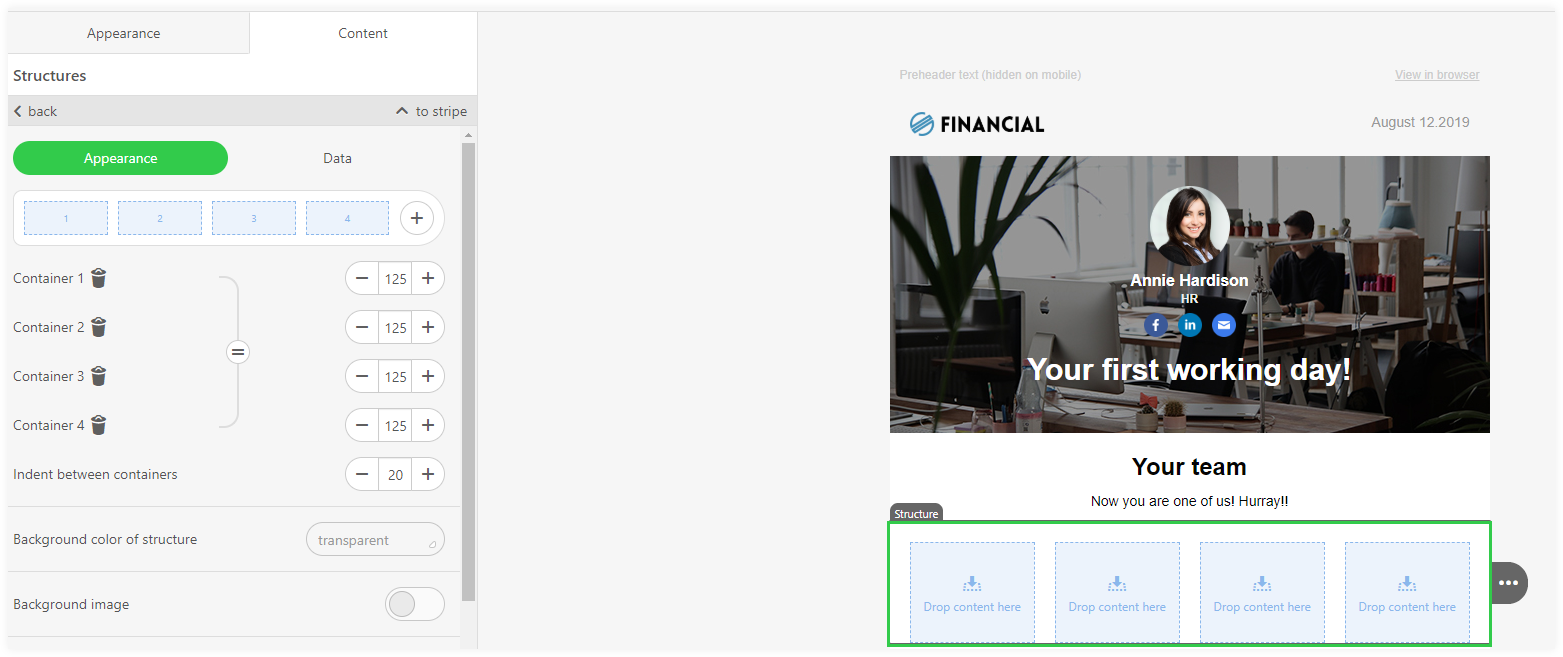
Structure
You can pick a Structure, that contains 1, 2, 3 or 4 Containers from the sub-menu Structures.
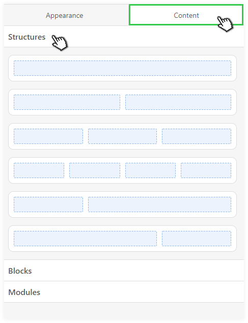
Please note, that you can add more Containers into your Structure after you placed it into your email. Each Structure can contain up to 8 Containers.
Blocks
Currently, there are 13 basic Blocks, including HTML block that allows you to embed custom code and custom email elements.
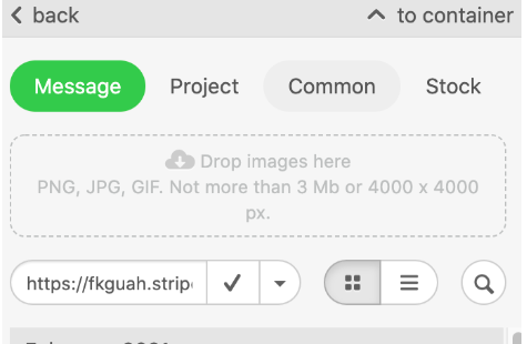
For example, Image basic block:
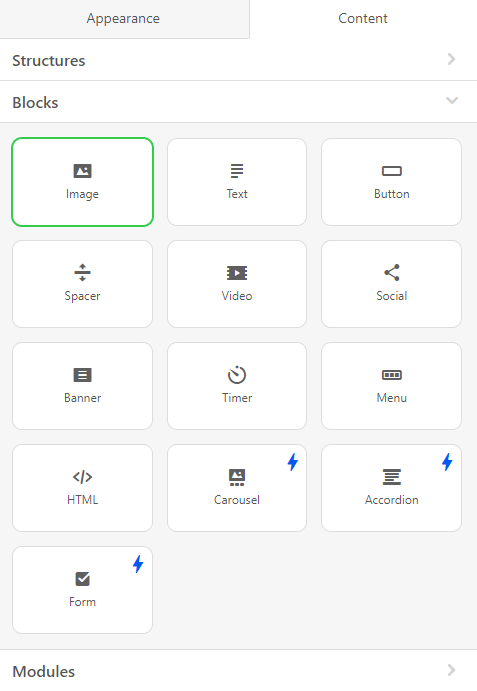
This block can be used for adding images in PNG, JPG or GIF formats with maximum size of 3Mb. The maximum resolution of the images are 4000x4000px.
You can add an image from your desktop by dragging it or paste a link to an external source.
Modules
The Modules menu contains previously saved Modules, that you can reuse and add into your email. In addition to this, you can use a template modules by dragging them into your email.
Stripes Settings
For Stripes, settings are available in three tabs – Appearance, Data and Conditions.
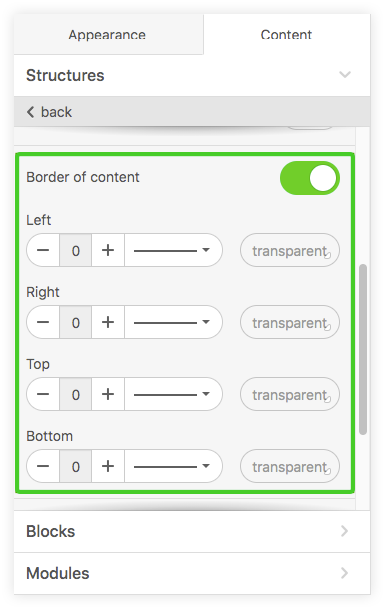
Also, you can set a common Border of content, or customize each side of each Stripe separately.
In addition, here you can hide some Stripes of the email for the desktop or mobile version if you don’t want them to be displayed.
Structure Settings
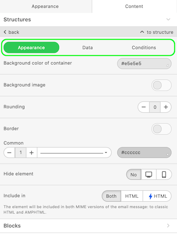
For Structures, settings are available in three tabs – Appearance, Data and Conditions.
In the Appearance tab, you can set Background color of structure or Background image.
Container Settings
For Containers, settings are available in two tabs – Appearance and Data.
The Data tab allows setting your Container as a Smart Container. More about Smart containers read here.
Conditions tab allows applying conditions which can be used in templates.
In the Appearance tab, you can set Background color of container or Background image.
Below you can set Rounding using + or - .

Also, you can set common Borders, or customize each Border separately.
In addition, here you can hide some Containers of the email for the desktop or mobile version if you don’t want them to be displayed.
Editing Area
Editing area takes the major part of the screen in edit mode.
It’s the area for editing emails and templates.
You can drag blocks / structures / modules into it from The Settings Panel.
Here you can set the required number of Stripes and their type.

Using the the drop-down menus, you can delete, move, copy, or save any email elements as modules.

You can select any element by clicking on it. After selecting, you will see settings for this particular in The **Settings Panel **(see the list of available settings for various elements above).
Each Stripe can contain an unlimited number of other elements.
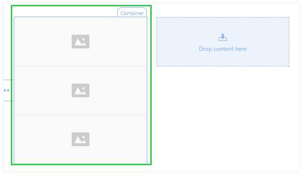
Each Structure can contain from 1 to 8 containers.
Containers can contain an unlimited number of other elements when you place it one under another, but if you want to place an element on the right or left, you would need to use different containers.
In addition, in the editing area, there is a chat icon so you can contact our support team in case of difficulties.